Typography
Typographic scale
The typographic system is based on utopia.fyi – a method of scaling type and space without breakpoints. The benefit is that websites built this way feel at home on any device.
Step -2 .u-step--2
Step -1 .u-step--1
Step 0 .u-step-0
Step 1 .u-step-1
Step 2 .u-step-2
Step 3 .u-step-3
Step 4 .u-step-4
Step 5 .u-step-5
Step 6 .u-step-6
Step 7 .u-step-7
Generated with Utopia
Note: these classes affect the font-size and letter-spacing, not the weight. Check out the headings further down the page for those classes.
SCSS mixin
Fluid typography is exposed via a SCSS mixin with the step($number) syntax. This allows us to fall back to a sensible default if the browser doesn't support custom properties For example:
.c-component {
  @include step(2);

  /* Generates */
  letter-spacing: -0.02em;
  font-size: 25.92px;
  font-size: var(--step-2);
}
For this font, letter-spacing is tightly coupled to the font-size, so this mixin covers that for you.
Utility classes
As well as the mixin, typographical units can be applied using utility classes:
<p class="u-step--1">Step -1</p>
Typeface
The website currently uses a single font family: Inter. This typeface has been selected for its;
- Excellent clarity and legibility
- Extensive character set
- Comprehensive weight and style options
- Understated authority
Unless there’s a specific reason;
- Text is regular weight and grey
- Headings are bold and grey
- Links are utility blue
- Links within copy are underlined
Hierarchy
Page titles use the largest heading size: Step 6. Section headings use the next size down: Step 5, and so on. Designers and content authors should follow this convention to ensure consistency.
However, other than in prose, there is no automatic relation between the HTML heading elements (<h2>), and the size of the text. This is an intentional semantic decision to allow us to control the page flow and the design, and not be hamstrung by one or the other.
Site-specific variation
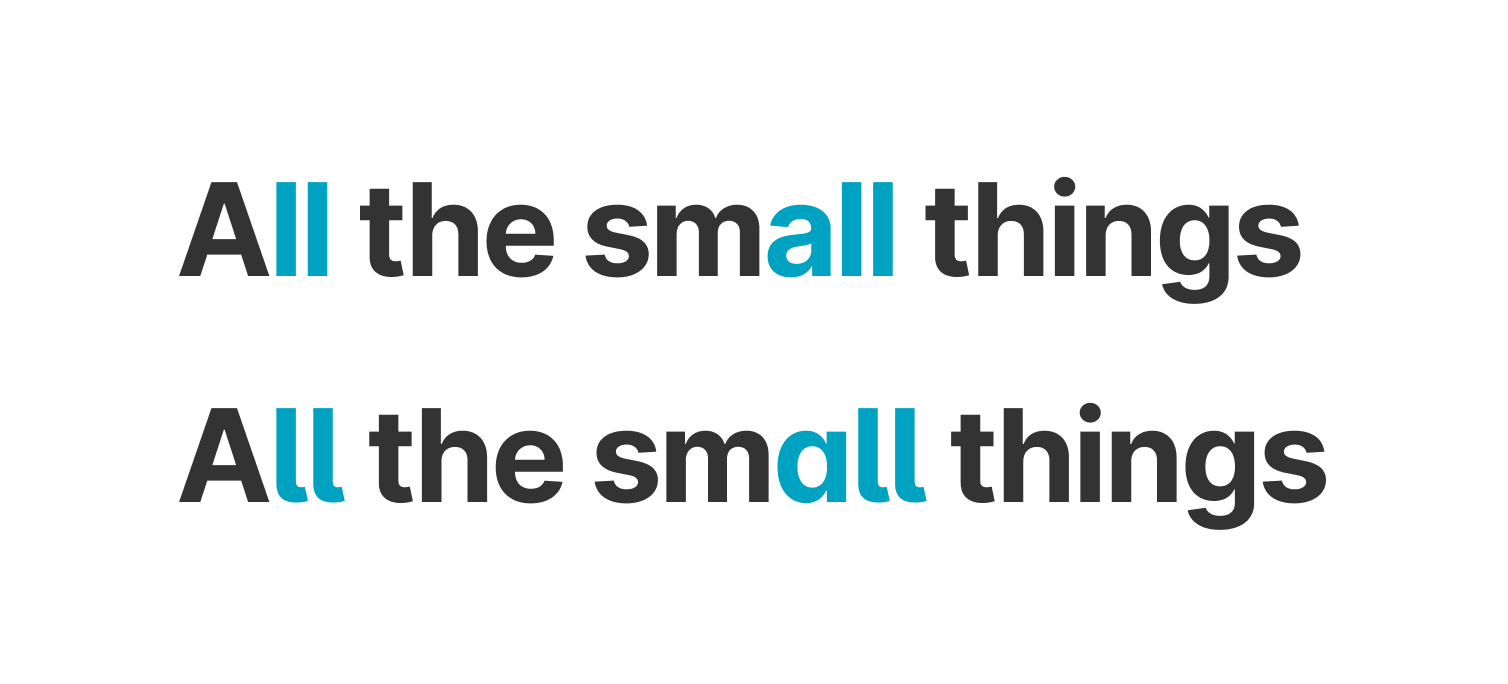
The blog uses the “stylistic alternates” character set to subtly soften the formal aesthetic of the Inter UI typeface.
Headings
Headings by default are bold and grey. In some contexts colour and weight variation can be used to highlight a specific element, for example a tagline on a product page. This option is used sparingly in order to maintain overall consistency.
Page title
c-h c-h--page-title
Step 6
c-h c-h--step-6
Step 5
c-h c-h--step-5
Step 4
c-h c-h--step-4
Step 3
c-h c-h--step-3
Step 2
c-h c-h--step-2
Step 1
c-h c-h--step-1
Step 0
c-h c-h--step-0
Step -1
c-h c-h--step--1
Page subtitle
c-h c-h--page-subtitle
Upper
c-h c-h--upper
Event date
c-h c-h--event-date
Reset
c-h c-h--reset